Tuesday 31 December 2013

Second Mock-up Front Cover.

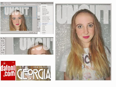
Here is the process of making my second front cover.


And here is the final result...


I really like this design, as I feel it fits with the genre of pop through her costume and make-up and also the artists mentions in the cover lines. The main problem with this one is that the font for 'GEORGIA' looks pixelated, I have tried to re-create it so it isn't, but I haven't been able to. I am also unsure about the masthead being behind her, I think this is because you can tell I've rubbed it out, its doesn't look like she is in front of it, causing it too look unprofessional.

Sunday 29 December 2013

Powerpoint Plans

I want to create 4 mock-up front covers, so when I come to creating my final one and can choose which one i like the best and use all the best features on all of the mock-ups to create a good professional final magazine.

I have already created one, but because I don't have fireworks at home, i cant create any others, so I've decided to plan out my next front cover idea's on powerpoint, so when I do get the software I already know what I'm doing and I only have to change fonts, colours and add the finishing touches. 

Here is my First Plan  - 


All I really have to do on this one is re-create it into fireworks, change the fonts on the masthead, headlines and cover lines, adjusting the size and colours slightly and I want to make the banners more transparent, as I feel the block colours make the magazine look unprofessional.


Second Plan -  
For this one I need to change all the fonts and colours. Use a new masthead, Fix the banner and re-size everything.


Third Plan -
For this one I need to create a pug and make it more transparent. Re-do the masthead, Change the font, sizes, and colours.


Thursday 12 December 2013

First Front Cover Mock-Up.

Here is the process of my Front Cover.


Im using fireworks to create my magazines. I start off with the image, and i enlarged it so it appears to be a close up of the artists face. I then adjusted the sharpness of the image- making it clearer. I then add my masthead.
I want my masthead to go across the top of the page, so to do this i change the font size,and spaces in-between the letters, so it goes from one side of the page to the other. I then added the Headline, and Cover lines. I haven't added many, this is because i want my magazine to be like ID and Dazed and Confused, and they don't have much text on there front covers, making the image the many focus on the magazine. Also because from my questionnaire, my target audience said they prefer more images to text/less text.


This is the finished result of my first magazine mock-up.

Wednesday 4 December 2013

How I Edited my images.


www.fotoflexer.com is the website i used to edit my images. It offers you loads of different ways to edit an image, It gives you the basic's, which include 'Crop' and adjusting the lighting and the contrast.
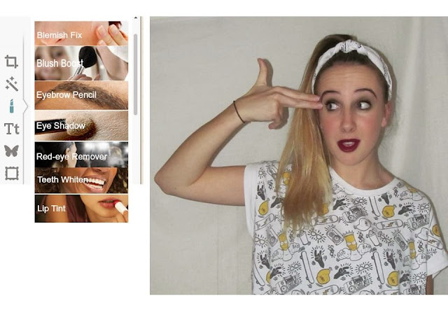
(Below is the 'Basic' Tool bar.)


The main thing i used the most on Fotoflexer is the effects tool.
(Below is the 'Effects' Tool bar.)

All the one's i used the most are on the image, I mainly used is 
Crossed Process
Lomoish
Colour Splash
Tint 
Greyscale
Sepia

All of these leave a nice effect on the image, making them look professional.

After editing the effect, i use the 'Beautify' Tool bar (Below) This allows you to make there skin look perfect, and Sharpening the image, making it clearer, and professional looking.


Then, to finish the image i use the 'Geek' Tool bar(Below), i only use the curving tool. This is because it can change the lighting on the image, colouring (From neutral to black and white) and clears the image, and it just adds the finishing touches to my image. 


Ive selected one of the images, i want to use to my magazine, and edited it in 4 different ways to show what i can do with FotoFlexer.


Top Left - Has been beautified, and added the effect 'Colour Process' too it, and then sharpened
.
Top Right - Has been changed to Greyscale, and lightened using the curves tool.

Bottom Left- Has been lightened, then  added 'Colour Process' effect, then upped the contrast, and brightened.

Bottom Right - Upped the contrast slightly, Using curves, been make darker with more shadows, then softened.


Ive tried a lot of different editing styles, and seeing which work best with my genre, and which would look best on a magazine. Ive used another programme called 'PicsArt' which you can get on an Iphone. This app gives you editing skills such as 'Artists effect,' 'Corrections' which lets you whiten teeth, get rid of red-eye and face fix. I mainly used the 'Pop Art' effect. I used this because it gives an edgy look, making it appear different to any other magazine.
From this app i created these images:


This is how i created these images:


Ive also used a lot of other editing websites too see what sort of effects i can get, to make my magazine a lot different to everyone else's. My favourite one i tried, and got the best results from is
www.picmoney.co.uk

This is what i created on the website, I want to use the images ive created on my front cover.


 <--- Final Results------>

Friday 29 November 2013

Pictures for my magazine

I have taken a lot of photo's for my music magazine, and I followed my planning chart when taking them. I have put all my images onto Flickr. The web address to see all my images is: http://www.flickr.com/photos/110678005@N07/

From all of the images I've taken, I picked 17 images which are the best for my magazine, and would look right on the front cover of a POP magazine, and the ones that are my favourite. I edited them on a website called FotoFlexer, which gives you the access to use profession editing equipment for free.
While taking my pictures, I followed the conventions of image's got magazines,I feel the two main and important one's are the shots (medium close ups and close ups) and eye contact. I looked back at magazines such as Dazed and Confused, Billboard and Q.


Wednesday 27 November 2013

Photo Planning

I'm going to have my friends Elise Jones, Georgia Waldron posing for my media magazine.I have asked and chosen these people as they all have an individual look about them, and look good on photos, They all mainly girls as they are the dominate gender in pop. The shots i want the most are Close-ups and Medium long shots with eye contact, this is so the reader/audience can capture there personalities through the image. I want Low angles so they appear powerful. For some images, i might have they facing away from the camera, for a different style of image, but if i do that i will use them for contents and double page spread. I have looked at the latest fashion trends/magazines, and also what the celebrities are wearing now in music videos.
Some examples of there apperance ect...
Elise:  Her hair will be extremely curly, (Her hair is brown too blonde ombre) I want her make-up to be more out there. E.g. Dark lipstick, lots of eye make-up. I want her appearance to be influenced by Rihanna, Miley Cyrus, Rita Ora. I want her to have the cool, pretty, edgy look. All her tops will be black, and all her bottoms will be high waisted. ( Shorts/Tartan Trousers) 
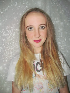
Georgia Waldron: Her hair will be long and straight (also a light brown too ombre blonde.) I want her make-up to be bright and pretty, red lipstick. Her appearance will be influenced by people like Katy Perry, Demi Lovato, Pixie Lott. I want her too look sweet,popular,quirky and edgy. She will have different tops on, that are different colours on, that have strange/unique patterns on, showing how different she is.

I think by the way I will style there hair, make-up and costume l really fit with the genre on POP. Also no pop artists are a-like, so I want them to look slightly different to each other, and other  artists. So they are original and cool looking. 

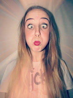
Everyone in my magazine will be young adults/teenagers, and representing people from that age to be a little naughty and edgy, but they have fun, and showing its the best age to be. They will be mainly females, as i they are the most dominant gender in the Pop world, but i will include male as i want it too appeal to both men and woman. I want them to go through a range of different facial expressions. E.g. Shocked, Serious, Pouted, Cross eyes, Sticking there tongue out. Showing them as silly and fun, repeating the representation of young people that i want to get across.

The shots will be taken mainly inside my house, I am setting up a photo studio type thing in my room, so i can get a white background, and good quality images, also im using different lighting to see which effects work best.
I will also get different shots from outside, by brick walls, in the dark and with a bright flash making the image look white and different. 

Here are some examples of previous magazines front cover images, and Photoshoots celebrities have done. I am hoping i can get images like these.


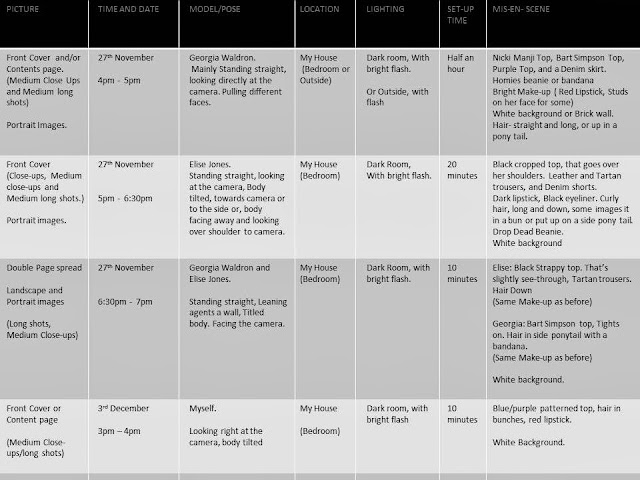
Ive set out my plan in a table, so its a clear way for me to know what to do, and when. 


COLOUR SCHEME

I want my magazine to appeal to mainly females, i have thought up a colour scheme that would work best with the genre, what would look nice on a magazine, what colours work well, and what my target audience would like, this is what i came up with....

These are the main colours I want to use for my magazine. This image shows which background would go best with certain colours, and what backdrop colour I would use.  
The colours I've put are either black, white or pastel colours, this is because they look nice, and most girls prefer pastel colours to bold ones, as they are most elegant and look nicer against a black background/Dark image, however if i want something to be eye catching I will use neon or a bold colour(or a red background with black or white writing over the top seen above) instead.


Tuesday 26 November 2013

Layouts for my Front Cover

(Click to enlarge)

Here are my layouts for my front cover. I want them to be quite simple, as I want the image to be the main focus, so I have only put a little text around the page.

These layouts have been influenced by Dazed and Confused and ID magazine's front covers. This is because I like there layout, and in my questionnaire almost everyone I asked did too, and even though they use  high quality images, The images I am going/want to take will live up to that standard.


Sunday 24 November 2013

Results from my Questionnaire

AGE-
15 - 23 : IIIII IIIII IIIII IIIII IIIII
24 - 35 :
36 - 44: 

GENDER-
Male : IIIII
Female : IIIII IIIII IIIII IIIII

OCCUPATION-
Student : IIIII IIIII IIIII III
Waitress/Bar: IIIII II

SOCO-ECO-
A :
B :
C :
D : III
E: IIIII IIIII IIIII IIIII II

MUSIC-
RnB : IIIII II
POP : IIIII IIIII IIIII IIIII
HIP HOP : IIIII I
CLASSICAL :
ROCK: I
HEAVY METAL :
INDIE : II
DANCE : IIIII III
DRUM AND BASS : IIIII IIII
OTHER :


HOW MUCH WOULD YOU PAY?
£0.99 - £1.99 : IIIII IIIII IIIII I
£2 - £2.99 : IIIII IIII
£3 - £4 : 

WHAT WOULD YOU LIKE TO SEE?
More Text : IIIII
Less Text :
More Images : IIIII IIIII IIIII
Less Images : I
Bit of Both : II II 


DO YOU GO ON MUSIC WEBSITES?
Yes : IIIII IIIII IIIII III
No : II IIIII


HOW OFTEN DO YOU BY MUSIC MAGAZINES?
Weekly : I
Monthly : IIIII
Fortnightly : IIIII IIII
Yearly : IIIII IIIII

WHICH LAYOUT DO YOU LIKE THE MOST?


BILLBOARD : I
ROLLING STONE : IIII
ID : IIIII IIIII
DAZED :  IIIII IIIII


BETTER NAME FOR A MUSIC MAGAZINE?
Influence : IIIII
Uncut : IIIII IIIII IIIII IIIII

BEST FONT/MASTHEAD

1 : IIIII IIIII II

2 : III


3 : IIIII

4 : III


5 : II


6 :  IIIII
7 : IIIII
8 : IIII

9 : IIIII IIII

10: II


PIE CHARTS  (Click to enlarge)