Page furniture is used to make the DPS different to all the others, and to make it more interesting. Without page furniture a DPS would be boring, They make the page eye catching and gives the reader a lot to do and look at.
Friday 21 February 2014
Double Page Spread Analysis and Examples
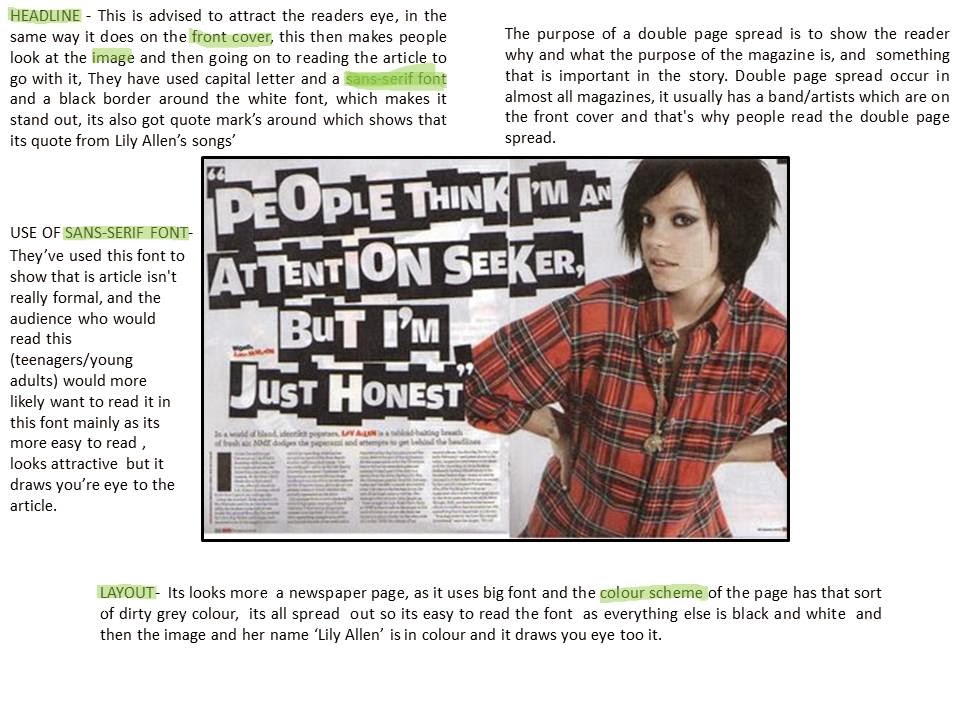
Here's an analysis of a DPS that I would like mine to look like:
Here are some examples of DPS that I like:
Conventions Of A Double Page Spread
A large image about the artist featured on the page.
A pull quote or quote from one of there songs.
Large and bold masthead and headline.
Introduction on the artist before reading the article (Blurb) seen under the Masthead.
Text in columns + the first letter of the article larger and bolder/different colour.
San-serif Font.
Other images.
Banners or Pugs advertising something.
Colour scheme (that links to the rest of the magazine)
Thursday 20 February 2014
Final Contents Page
Final Contents page, that im happy with, and links with my Front Cover
Process of re-making the Contents page.
This is my first final Contents page, but i dont think it links to my Front Cover as good, so ive decided to change little things so it links and looks better,
Tuesday 11 February 2014
Second Mock-Up
After getting some feedback about my first mock-up, I decided to try out using one main image as the real focus to the contents page and then add loads of little image around it. I re-did some research looking back at professional magazines and I realised I needed to make the columns more obvious and add banners. This is the result:
I feel this contents page is a lot better than my first one, and really links to the POP genre, Colour scheme, Housing style and the Front cover. I will improve this one more, adding pugs, moving the columns around and adding more text too see how it looks.
Saturday 8 February 2014
First Contents Page Mock-Up
This is my first idea for my contents page. I've taken influence from Dazed and Confused magazine and also Q.
Here's the process of my first contents page.
Here's the process of my first contents page.
The result:
I really like this contents page. However I don't think its suitable for my final contents page, as the two images put together make the face look distorted and isn't nice to look at, also this image doesn't link to my Front cover. But the pug, features/articles and other images work very well and I will be using them again in different mock ups. I do like the images in the bottom left corner, I've masked this image making her appear to be popping up on the page, I used a speech bubble as I've seen it a few times when researching pop magazines, however I feel its creates a childish and tacky effect to the contents page, and I wont be using it again.
Subscribe to:
Posts (Atom)


