Tuesday 31 December 2013

Second Mock-up Front Cover.

Here is the process of making my second front cover.


And here is the final result...


I really like this design, as I feel it fits with the genre of pop through her costume and make-up and also the artists mentions in the cover lines. The main problem with this one is that the font for 'GEORGIA' looks pixelated, I have tried to re-create it so it isn't, but I haven't been able to. I am also unsure about the masthead being behind her, I think this is because you can tell I've rubbed it out, its doesn't look like she is in front of it, causing it too look unprofessional.

Sunday 29 December 2013

Powerpoint Plans

I want to create 4 mock-up front covers, so when I come to creating my final one and can choose which one i like the best and use all the best features on all of the mock-ups to create a good professional final magazine.

I have already created one, but because I don't have fireworks at home, i cant create any others, so I've decided to plan out my next front cover idea's on powerpoint, so when I do get the software I already know what I'm doing and I only have to change fonts, colours and add the finishing touches. 

Here is my First Plan  - 


All I really have to do on this one is re-create it into fireworks, change the fonts on the masthead, headlines and cover lines, adjusting the size and colours slightly and I want to make the banners more transparent, as I feel the block colours make the magazine look unprofessional.


Second Plan -  
For this one I need to change all the fonts and colours. Use a new masthead, Fix the banner and re-size everything.


Third Plan -
For this one I need to create a pug and make it more transparent. Re-do the masthead, Change the font, sizes, and colours.


Thursday 12 December 2013

First Front Cover Mock-Up.

Here is the process of my Front Cover.


Im using fireworks to create my magazines. I start off with the image, and i enlarged it so it appears to be a close up of the artists face. I then adjusted the sharpness of the image- making it clearer. I then add my masthead.
I want my masthead to go across the top of the page, so to do this i change the font size,and spaces in-between the letters, so it goes from one side of the page to the other. I then added the Headline, and Cover lines. I haven't added many, this is because i want my magazine to be like ID and Dazed and Confused, and they don't have much text on there front covers, making the image the many focus on the magazine. Also because from my questionnaire, my target audience said they prefer more images to text/less text.


This is the finished result of my first magazine mock-up.

Wednesday 4 December 2013

How I Edited my images.


www.fotoflexer.com is the website i used to edit my images. It offers you loads of different ways to edit an image, It gives you the basic's, which include 'Crop' and adjusting the lighting and the contrast.
(Below is the 'Basic' Tool bar.)


The main thing i used the most on Fotoflexer is the effects tool.
(Below is the 'Effects' Tool bar.)

All the one's i used the most are on the image, I mainly used is 
Crossed Process
Lomoish
Colour Splash
Tint 
Greyscale
Sepia

All of these leave a nice effect on the image, making them look professional.

After editing the effect, i use the 'Beautify' Tool bar (Below) This allows you to make there skin look perfect, and Sharpening the image, making it clearer, and professional looking.


Then, to finish the image i use the 'Geek' Tool bar(Below), i only use the curving tool. This is because it can change the lighting on the image, colouring (From neutral to black and white) and clears the image, and it just adds the finishing touches to my image. 


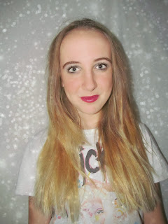
Ive selected one of the images, i want to use to my magazine, and edited it in 4 different ways to show what i can do with FotoFlexer.


Top Left - Has been beautified, and added the effect 'Colour Process' too it, and then sharpened
.
Top Right - Has been changed to Greyscale, and lightened using the curves tool.

Bottom Left- Has been lightened, then  added 'Colour Process' effect, then upped the contrast, and brightened.

Bottom Right - Upped the contrast slightly, Using curves, been make darker with more shadows, then softened.


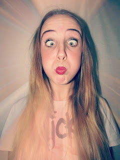
Ive tried a lot of different editing styles, and seeing which work best with my genre, and which would look best on a magazine. Ive used another programme called 'PicsArt' which you can get on an Iphone. This app gives you editing skills such as 'Artists effect,' 'Corrections' which lets you whiten teeth, get rid of red-eye and face fix. I mainly used the 'Pop Art' effect. I used this because it gives an edgy look, making it appear different to any other magazine.
From this app i created these images:


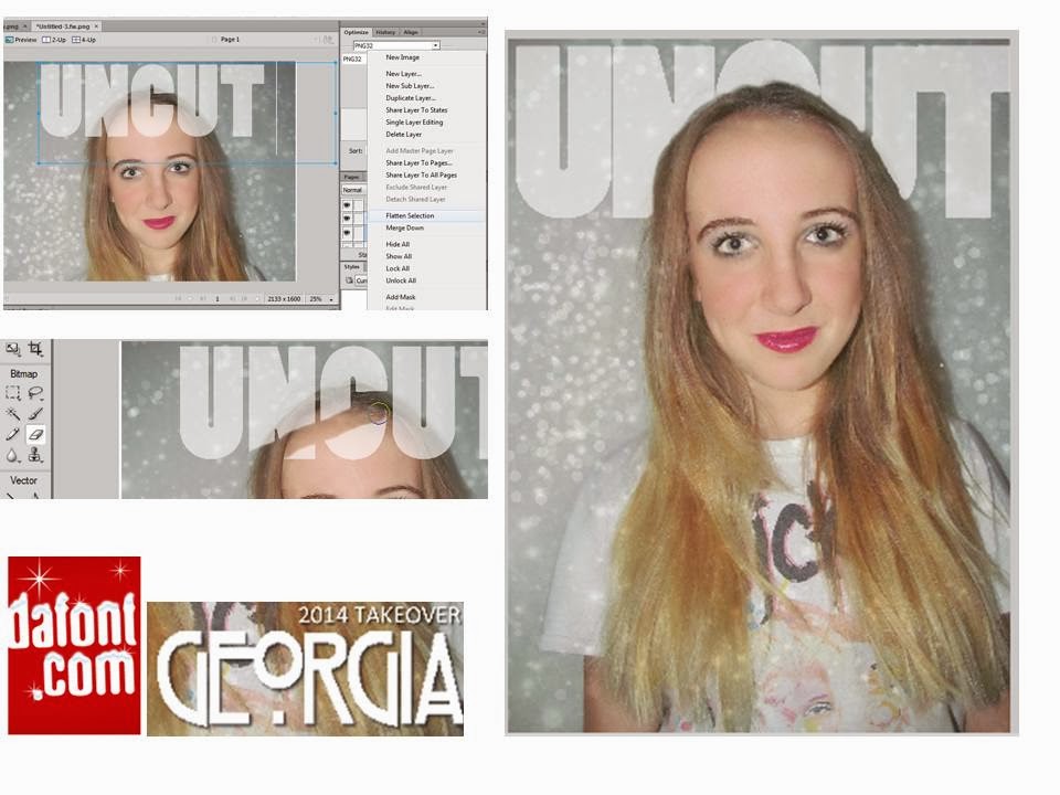
This is how i created these images:


Ive also used a lot of other editing websites too see what sort of effects i can get, to make my magazine a lot different to everyone else's. My favourite one i tried, and got the best results from is
www.picmoney.co.uk

This is what i created on the website, I want to use the images ive created on my front cover.


 <--- Final Results------>