Saturday 26 April 2014
EVALUATION - Question 7
Magazines by Slidely Slideshow
This Slidely shows the comparison between my school magazine and my music magazine. You can see how much I've learn when creating magazines. I've learnt about layout and where everything should be placed to look its best, This also includes the code and conventions. I've also learn about how emphasis of fonts and colour can effect the look on the magazine, and how by making something bigger and closer together will create a professional and styled look.
One thing that i developed an understanding for was aiming at the correct audience, and representing the artists correctly through the image(What she is wearing, her pose, colours.) This was the biggest challenge, i feel like i have accomplished this.
Thursday 24 April 2014
EVALUATION - Question 6
What have I learnt about new technologies?
Through the creation of my magazine's I have been using many technologies to help my research,design and create my media text. These have helped my through the process of not only my music magazine, but my school one.
 The first software that I was introduced to was Blogger. This is where I have presented all my work onto. Its a fast simple way to present my coursework and make it look good. The first thing we did on blogger was to analyse a music magazine front cover, this helped me understand how to use this website and how to present it correctly.
you can see from then to now how much my skills of presenting have increased, Then I didn't know what embedding was or how to, or turn into a powerpoint slide into a JPEG so the first post i ever did was very messy but now they have improved.
I've also learnt about embedding. The first time i learnt how to embed was when i used Prezi to research into 'Kerrang!' This is a software that allows you to create presentations on a virtual canvas, it has a zooming user interface, which allows you to zoom in and out of different text boxes while presenting. It has a button which allows you to embed on to websites such as blogger so you can activate and work it on the blog.
 Many other websites have allowed me to embed onto my blog. Most of these i have used in my Evaluations....
Padlet: Scidb:


ThingLink:

When creating both my school magazine and my music magazine I used a software called Fireworks, this is a bitmap and vector graphics editor, This allows people to design and make magazines, posters ect... Fireworks has many features such as editing images, cropping, re-colouring, use of different fonts and changing the appearance/style , adding variety of images, fading them, Different painting tools, Creating Shapes.
Example of some of these:

I already knew how to do simple things on fireworks but one of the main things that i had to learn how to do was using font from the web and putting it onto Fireworks and making it look good ( Not pixelated.) I used a font website called dafont.com.

This gave me many different styles of fonts that I could use for my magazine.
On my front cover I've used a font from this website, but I had to do a lot of things on fireworks to get rid of the pixels and changing the colour ect....
Here's an example of what I had to do:
 I first choose what I want, then print screen it into fireworks and crop it down, so all ive got it the text.
 Then i use the magic wand tool (Top button circled in red) This deletes all the background and anything else apart from the text. Then i use the bitmap tool and square off the text.Them you use the arrow to select it, and then you can paint and change colour and hide all the pixels and see if anything is out of shape or cut out.
This technique I have used a lot on my magazine.
Another website I've used is Flickr. This is a software which allows you to store all images on a viral hardware. This was perfect for when i was taking different images for my magazine and i didn't need keep them on my computer.This made things easier for when i was editing images, and all i would do it copy paste them, or save them to re-upload them into an editing website.
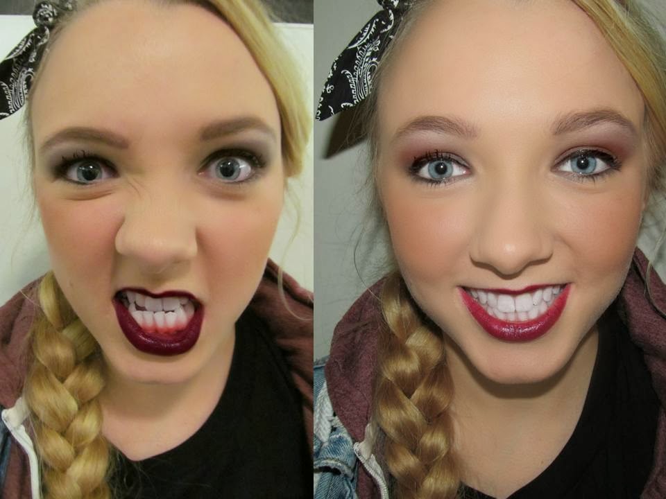
One of the main things i did for my magazine was editing images. I used mainy websites such as fotoflexer.co.uk picmonkey.com and befunky.com. At first i found these really complicated to use, but once I'd done it once it was very easy. All these websites allowed me to use all photoshop equipment for free, which helped my magazine look as professional as i wanted. The website offered:

Teeth whitening
Tanning
Airbrushing
Eye Bright
Black and White effect
Sepia effect
Cropping
Contrast
And many more...
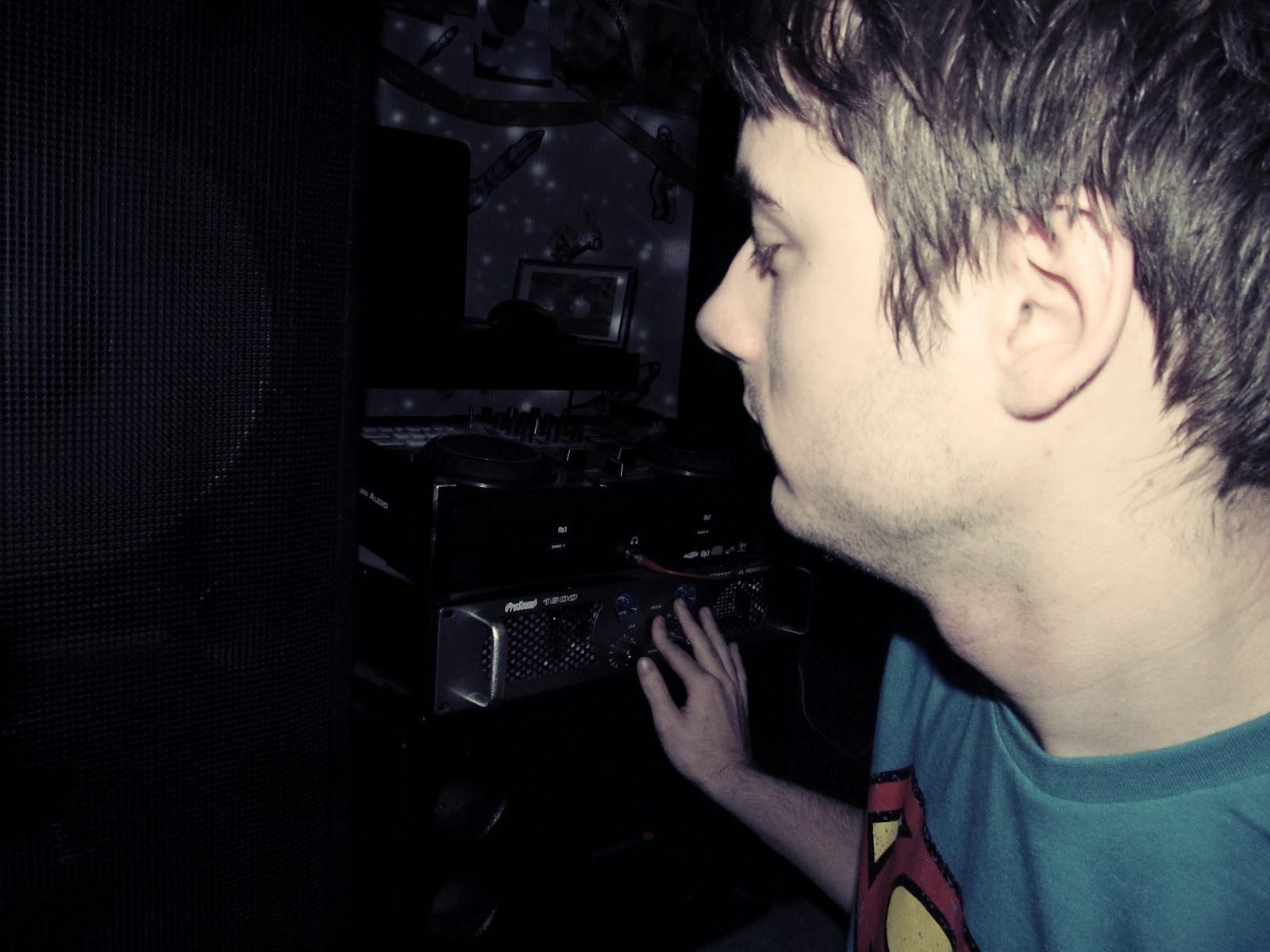
Finally another software which I already knew how to use, but but as a user was YouTube.
For apart of my evaluation I interviewed someone who is apart of my target audience. I had to set up a YouTube account and learn how to upload on my mobile, This allowed me to understand how to create and use free video websites such as YouTube to allow me to experience using it.
Overall through the process of making my magazine's, I've learnt all about different software's and what they can do. This had enlarged my list of media forms and software's I know how to use, This will help me in the future.
Through the creation of my magazine's I have been using many technologies to help my research,design and create my media text. These have helped my through the process of not only my music magazine, but my school one.
The first software that I was introduced to was Blogger. This is where I have presented all my work onto. Its a fast simple way to present my coursework and make it look good. The first thing we did on blogger was to analyse a music magazine front cover, this helped me understand how to use this website and how to present it correctly.you can see from then to now how much my skills of presenting have increased, Then I didn't know what embedding was or how to, or turn into a powerpoint slide into a JPEG so the first post i ever did was very messy but now they have improved.
I've also learnt about embedding. The first time i learnt how to embed was when i used Prezi to research into 'Kerrang!' This is a software that allows you to create presentations on a virtual canvas, it has a zooming user interface, which allows you to zoom in and out of different text boxes while presenting. It has a button which allows you to embed on to websites such as blogger so you can activate and work it on the blog.
Padlet: Scidb:
ThingLink:
When creating both my school magazine and my music magazine I used a software called Fireworks, this is a bitmap and vector graphics editor, This allows people to design and make magazines, posters ect... Fireworks has many features such as editing images, cropping, re-colouring, use of different fonts and changing the appearance/style , adding variety of images, fading them, Different painting tools, Creating Shapes.
Example of some of these:
I already knew how to do simple things on fireworks but one of the main things that i had to learn how to do was using font from the web and putting it onto Fireworks and making it look good ( Not pixelated.) I used a font website called dafont.com.
This gave me many different styles of fonts that I could use for my magazine.
On my front cover I've used a font from this website, but I had to do a lot of things on fireworks to get rid of the pixels and changing the colour ect....
Here's an example of what I had to do:
This technique I have used a lot on my magazine.
Another website I've used is Flickr. This is a software which allows you to store all images on a viral hardware. This was perfect for when i was taking different images for my magazine and i didn't need keep them on my computer.This made things easier for when i was editing images, and all i would do it copy paste them, or save them to re-upload them into an editing website.
One of the main things i did for my magazine was editing images. I used mainy websites such as fotoflexer.co.uk picmonkey.com and befunky.com. At first i found these really complicated to use, but once I'd done it once it was very easy. All these websites allowed me to use all photoshop equipment for free, which helped my magazine look as professional as i wanted. The website offered:
Teeth whitening
Tanning
Airbrushing
Eye Bright
Black and White effect
Sepia effect
Cropping
Contrast
And many more...
Finally another software which I already knew how to use, but but as a user was YouTube.
For apart of my evaluation I interviewed someone who is apart of my target audience. I had to set up a YouTube account and learn how to upload on my mobile, This allowed me to understand how to create and use free video websites such as YouTube to allow me to experience using it.
Overall through the process of making my magazine's, I've learnt all about different software's and what they can do. This had enlarged my list of media forms and software's I know how to use, This will help me in the future.
EVALUATION- Question 5
How did you attract/ address your target audience? (Using thinglink) Scroll over black circles on images.
https://www.thinglink.com/user/509658115273129985/scenes <


https://www.thinglink.com/user/509658115273129985/scenes <


Tuesday 1 April 2014
EVALUATION - Question 4
Who would be the audience for your media product?
The magazine is appealing to people who like artists such as Beyonce, Katy Perry, Robin Thicke, One Direction, Miley Cryus ect.. These are the big artist currently dominating the Top 40. People who like these artist copy their clothes, lifestyle choices and other things they do. My audience could be seen as egoists as they seek pleasure from listening to music, Mainstream as they follow the popular crowd and because pop music is accepted and listened to by the majority of teenagers and are also innovators as they want to make there mark, this could be with the clothes they wear.
My music magazine targets teenagers/young adults, aged around 15 - 24 and mainly females this is because female artist dominate the pop charts and boy bands are commonly known having huge female fan base however males are targeted to, just not as strongly, they fit into the JICNAR scale C2DE which are generally students. They are into fashion, and like the big mainstream shops for example TopShop, RiverIsland, Selfridges, Urban Outfitters, TopMan. You would see them in the clothes seen in fashion magazines (Vogue) and on catwalks. There class and status are all different as pop music reaches out to a wide range of people. These types of people spend there free time going out shopping, or going bars and clubs, these are the things they spend there money on, also on gigs and tours and going out with friends in popular locations. Most of these people own Iphones, engage in other media's like Twitter, YouTube and Instagram.
Whats my target audience look like...
(These are people i know who listen to pop music)
(t

I'm going to interview some of my ideal readers, I'm going to show them my magazine and see if i have connected with the target audience i wanted.
Questions i'm asking them:
What do you think of my magazines?
I Would you buy this magazine?
Are the images, font and colour scheme appealing to you? Do they fit with the theme of the magazine?
Do you think YOU would read more of my magazines, is it aimed at the right audience?
Would you pay £1.99 for this magazine?
Whats you favorite part of my magazine?
Is there anything you would change?
Ive put my interview onto Youtube-
https://www.youtube.com/watch?v=QkBLnrSEJwA
Whats my target audience look like...
(These are people i know who listen to pop music)
(t
Questions i'm asking them:
What do you think of my magazines?
I Would you buy this magazine?
Are the images, font and colour scheme appealing to you? Do they fit with the theme of the magazine?
Do you think YOU would read more of my magazines, is it aimed at the right audience?
Would you pay £1.99 for this magazine?
Whats you favorite part of my magazine?
Is there anything you would change?
Ive put my interview onto Youtube-
https://www.youtube.com/watch?v=QkBLnrSEJwA
Thursday 27 March 2014
Monday 17 March 2014


Sunday 16 March 2014
Final Double Page Spread's


I decided to create two double page spread, and link them together. I wanted to create a double page spread talking about two big celebrates joining together, but because my main focus of the magazine was Elise, i made one DPS all about her, and then joining it onto another DPS explaining them going on tour together. I feel I have done this well, and it all links together with my front cover and my contents page.
Sunday 9 March 2014
Another Double Page Spread Idea/Mock-Ups


I'm going to use this images for my final one, as its looks good for a DPS article, and even though it must link with the rest of the magazine, it is slightly different so my audience will be more interested in reading it.
Saturday 8 March 2014
Third And Forth Mock-Up


I think these to mock-ups are very successful, however i want my magazine to look good and exciting for the audience to read, and i think this is too alike, and the audience will get bored of seeing the same pose/face and house style. But i do like the article and colour scheme and i will use them again.
New Double Page Spread Article
What would you say if we told you that the
next big pop star is still in University, and was discovered at a talent show? Thanks
to her insta-hit "Countdown" an infectious pop tune that's topped
the charts in the UK for months (and is speedily on its way to doing the same
in America), Elise Jones has become this year's queen of summer radio.
The 19-year-old took a break from recording her 2nd album in London
to talk about her sudden fame, fashion icon status, and love of POP.
In the last year , you've caught the attention
of everyone from New York magazine to The Guardian. How does this sudden fame feel?
To be honest, I've been quite sheltered from it because I've been in the studio in London working on the album. But it's been rad. I'm happy that people are taking to what I'm doing. I thought I was gonna be a one hit wonder, so a year on and being a worldwide pop sensation is incredible!
To be honest, I've been quite sheltered from it because I've been in the studio in London working on the album. But it's been rad. I'm happy that people are taking to what I'm doing. I thought I was gonna be a one hit wonder, so a year on and being a worldwide pop sensation is incredible!
How'd you get discovered?
I sang in the school talent show when I was 12, and a video of it ended up with a record company.
I sang in the school talent show when I was 12, and a video of it ended up with a record company.
What inspires your songs?
A lot of it is just from hanging out with my friends, and things that I see and hear in those situations. I think young people are the most creative and the coolest—people that we should be learning from. Even when I'm at a party, I'm analyzing it and thinking about it in the context of how I would write about it. That side of me never switches off.
A lot of it is just from hanging out with my friends, and things that I see and hear in those situations. I think young people are the most creative and the coolest—people that we should be learning from. Even when I'm at a party, I'm analyzing it and thinking about it in the context of how I would write about it. That side of me never switches off.
When did you start writing music?
I think it would've been about 13 that I properly started writing, but before that, I wrote short fiction. That's my first love.
I think it would've been about 13 that I properly started writing, but before that, I wrote short fiction. That's my first love.
What was the concept behind the music video
for "Countdown"? It's so great.
Teenage life, in London anyway, can be so mundane and so boring. You feel like it's the waiting period of your life. We can't get into bars, we can't drive or anything so it can be frustrating sometimes and I wanted to portray that instead of just, like, 'yay!'
Teenage life, in London anyway, can be so mundane and so boring. You feel like it's the waiting period of your life. We can't get into bars, we can't drive or anything so it can be frustrating sometimes and I wanted to portray that instead of just, like, 'yay!'
You're still in University, so what do your
classmates think about all of this?
People are pretty good about it. My friends don't treat me any differently. But a lot of young boys are super weird about it. They'll just, like, run up to me on the street.
People are pretty good about it. My friends don't treat me any differently. But a lot of young boys are super weird about it. They'll just, like, run up to me on the street.
What kind of music do you like to listen to?
Everyone always says 'I listen to everything,' but I do listen to a lot of music. I listen to heaps of electronic music, heaps of hip-hop, and straight up Top 40 pop music as well.
Everyone always says 'I listen to everything,' but I do listen to a lot of music. I listen to heaps of electronic music, heaps of hip-hop, and straight up Top 40 pop music as well.
Who would you say inspires your sound?
Musicians like Beyonce were a big influence on me. How she uses her vocals is amazing. And then Disclosure andJay-Z, who aren't pop artists exactly, but they do something that is so catchy and undeniable and so much fun. The idea of being able to do something that is super fun and that you can dance to—but in the smart way—has always been really appealing to me.
Musicians like Beyonce were a big influence on me. How she uses her vocals is amazing. And then Disclosure andJay-Z, who aren't pop artists exactly, but they do something that is so catchy and undeniable and so much fun. The idea of being able to do something that is super fun and that you can dance to—but in the smart way—has always been really appealing to me.
You've become a bit of a style icon. Are you
into fashion?
I've always loved clothes. I'm not super clued up on brands, because it's expensive! But I love clothes and I have a Tumblr, and I'm always looking at stuff I want to get or want to try to make.
I've always loved clothes. I'm not super clued up on brands, because it's expensive! But I love clothes and I have a Tumblr, and I'm always looking at stuff I want to get or want to try to make.
What do you like to wear on stage?
A lot of long dresses, and I also have this obsession with disgustingly chunky sneakers and shoes. That's what stagewear is about for me—I've got to feel strong and feel like I can command attention.
A lot of long dresses, and I also have this obsession with disgustingly chunky sneakers and shoes. That's what stagewear is about for me—I've got to feel strong and feel like I can command attention.
We all know teens love social media. How do
you feel about Twitter and Instagram?
I actually love Twitter and Instagram. I do think it's so strange to think that 20 years ago, people would never have known personal stuff about musicians and actors, but I like it. As long as I don't obsessively overshare, it's OK. And when I do overshare, it's just like me saying, "I've got $7 in my bank account!"
I actually love Twitter and Instagram. I do think it's so strange to think that 20 years ago, people would never have known personal stuff about musicians and actors, but I like it. As long as I don't obsessively overshare, it's OK. And when I do overshare, it's just like me saying, "I've got $7 in my bank account!"
First Two Double Page Spread Mock-Ups


I really dont like these two mock-ups as i think they look un professional, and tacky. The images dont work, and it doesnt link with the rest of my magazine. I've decided to try a different article i've wrote, and completely change the layout and images.
Friday 21 February 2014
Page Furniture

Page furniture is used to make the DPS different to all the others, and to make it more interesting. Without page furniture a DPS would be boring, They make the page eye catching and gives the reader a lot to do and look at.


Double Page Spread Analysis and Examples
Here's an analysis of a DPS that I would like mine to look like:
Here are some examples of DPS that I like:

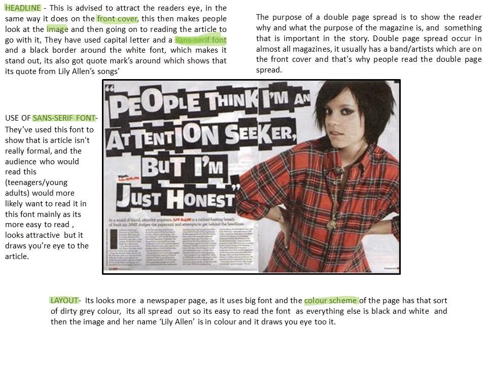
Conventions Of A Double Page Spread
A large image about the artist featured on the page.
A pull quote or quote from one of there songs.
Large and bold masthead and headline.
Introduction on the artist before reading the article (Blurb) seen under the Masthead.
Text in columns + the first letter of the article larger and bolder/different colour.
San-serif Font.
Other images.
Banners or Pugs advertising something.
Colour scheme (that links to the rest of the magazine)
Thursday 20 February 2014
Final Contents Page
Final Contents page, that im happy with, and links with my Front Cover

Process of re-making the Contents page.

This is my first final Contents page, but i dont think it links to my Front Cover as good, so ive decided to change little things so it links and looks better,

Tuesday 11 February 2014


Second Mock-Up
After getting some feedback about my first mock-up, I decided to try out using one main image as the real focus to the contents page and then add loads of little image around it. I re-did some research looking back at professional magazines and I realised I needed to make the columns more obvious and add banners. This is the result:

I feel this contents page is a lot better than my first one, and really links to the POP genre, Colour scheme, Housing style and the Front cover. I will improve this one more, adding pugs, moving the columns around and adding more text too see how it looks.
Saturday 8 February 2014
First Contents Page Mock-Up
This is my first idea for my contents page. I've taken influence from Dazed and Confused magazine and also Q.
Here's the process of my first contents page.


Here's the process of my first contents page.
The result:
I really like this contents page. However I don't think its suitable for my final contents page, as the two images put together make the face look distorted and isn't nice to look at, also this image doesn't link to my Front cover. But the pug, features/articles and other images work very well and I will be using them again in different mock ups. I do like the images in the bottom left corner, I've masked this image making her appear to be popping up on the page, I used a speech bubble as I've seen it a few times when researching pop magazines, however I feel its creates a childish and tacky effect to the contents page, and I wont be using it again.
Friday 31 January 2014
Photo's for my Contents Page
All the photo's I've taken are on my Flickr account -- http://www.flickr.com/photos/110678005@N07/
Here are some of the best images I've taken and edited on picmonkey, and the one's I'm most likely to use on my Contents page.


Here are some of the best images I've taken and edited on picmonkey, and the one's I'm most likely to use on my Contents page.
Subscribe to:
Posts (Atom)