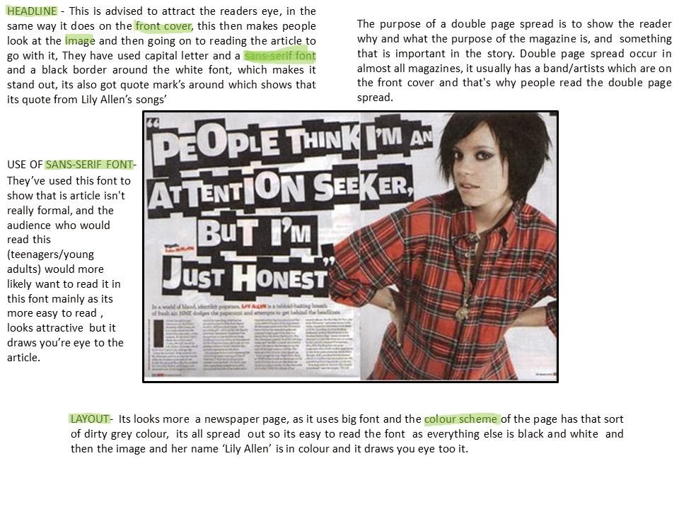
Here's an analysis of a DPS that I would like mine to look like:
Here are some examples of DPS that I like:
Conventions Of A Double Page Spread
A large image about the artist featured on the page.
A pull quote or quote from one of there songs.
Large and bold masthead and headline.
Introduction on the artist before reading the article (Blurb) seen under the Masthead.
Text in columns + the first letter of the article larger and bolder/different colour.
San-serif Font.
Other images.
Banners or Pugs advertising something.
Colour scheme (that links to the rest of the magazine)


No comments:
Post a Comment