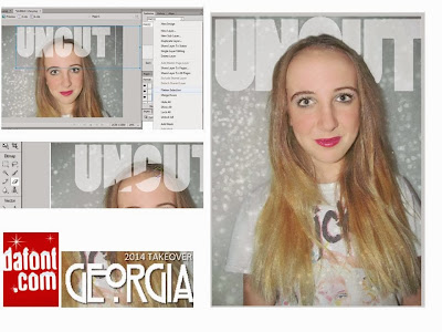
And here is the final result...
I really like this design, as I feel it fits with the genre of pop through her costume and make-up and also the artists mentions in the cover lines. The main problem with this one is that the font for 'GEORGIA' looks pixelated, I have tried to re-create it so it isn't, but I haven't been able to. I am also unsure about the masthead being behind her, I think this is because you can tell I've rubbed it out, its doesn't look like she is in front of it, causing it too look unprofessional.


No comments:
Post a Comment