Some examples of there apperance ect...
Elise: Her hair will be extremely curly, (Her hair is brown too blonde ombre) I want her make-up to be more out there. E.g. Dark lipstick, lots of eye make-up. I want her appearance to be influenced by Rihanna, Miley Cyrus, Rita Ora. I want her to have the cool, pretty, edgy look. All her tops will be black, and all her bottoms will be high waisted. ( Shorts/Tartan Trousers)
Georgia Waldron: Her hair will be long and straight (also a light brown too ombre blonde.) I want her make-up to be bright and pretty, red lipstick. Her appearance will be influenced by people like Katy Perry, Demi Lovato, Pixie Lott. I want her too look sweet,popular,quirky and edgy. She will have different tops on, that are different colours on, that have strange/unique patterns on, showing how different she is.
I think by the way I will style there hair, make-up and costume l really fit with the genre on POP. Also no pop artists are a-like, so I want them to look slightly different to each other, and other artists. So they are original and cool looking.
Everyone in my magazine will be young adults/teenagers, and representing people from that age to be a little naughty and edgy, but they have fun, and showing its the best age to be. They will be mainly females, as i they are the most dominant gender in the Pop world, but i will include male as i want it too appeal to both men and woman. I want them to go through a range of different facial expressions. E.g. Shocked, Serious, Pouted, Cross eyes, Sticking there tongue out. Showing them as silly and fun, repeating the representation of young people that i want to get across.
The shots will be taken mainly inside my house, I am setting up a photo studio type thing in my room, so i can get a white background, and good quality images, also im using different lighting to see which effects work best.
I will also get different shots from outside, by brick walls, in the dark and with a bright flash making the image look white and different.
Here are some examples of previous magazines front cover images, and Photoshoots celebrities have done. I am hoping i can get images like these.
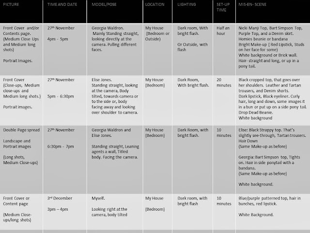
Ive set out my plan in a table, so its a clear way for me to know what to do, and when.
COLOUR SCHEME
I want my magazine to appeal to mainly females, i have thought up a colour scheme that would work best with the genre, what would look nice on a magazine, what colours work well, and what my target audience would like, this is what i came up with....
These are the main colours I want to use for my magazine. This image shows which background would go best with certain colours, and what backdrop colour I would use.
The colours I've put are either black, white or pastel colours, this is because they look nice, and most girls prefer pastel colours to bold ones, as they are most elegant and look nicer against a black background/Dark image, however if i want something to be eye catching I will use neon or a bold colour(or a red background with black or white writing over the top seen above) instead.


No comments:
Post a Comment