Friday, 31 January 2014

Photo's for my Contents Page

All the photo's I've taken are on my Flickr account -- http://www.flickr.com/photos/110678005@N07/

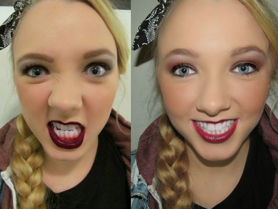
Here are some of the best images I've taken and edited on picmonkey, and the one's I'm most likely to use on my Contents page.


Photo Planning

 I've decided to get more images for my contents page, this is because when I was researching into CP's they all had 4 or more images of different artists on the page, and because I want my magazine to be as good as the professional ones.


Tuesday, 28 January 2014

Layouts for my Contents Page

Here are my layouts for my contents page, they vary between double pages and single pages, however most of them are double page spreads, because when I researched into contents pages all the mainstream magazines used double pages and they all looked the best, so I'm going to do the same as I want my magazine to be as good as the mainstream ones.


Conventions and Examples of Contents Page's

Conventions:
Title/Masthead
Numbers
Images ( With captions)
Headlines
Blurb/Sub-text
Pull Quotes
House style and Colour scheme
Different size and style font
Date
Banners
Structure (Columns)

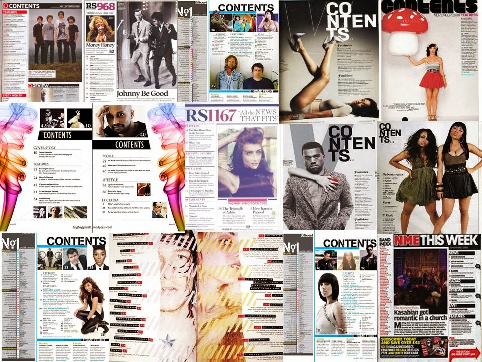
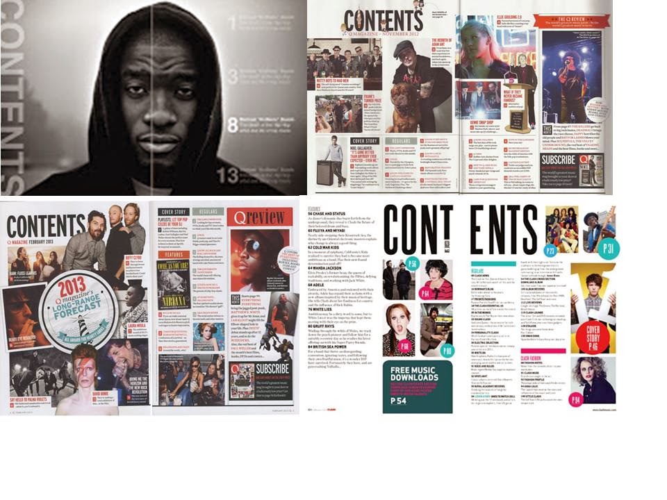
Example's of Music magazine Contents page's

Friday, 24 January 2014

Final Front Cover


My front cover follows all the conventions of a professional music magazine, I have used large close up of Elise for the cover, as the image links to the representation and brand identity I wanted to create, the colour scheme, cover lines and features also link. My magazine is called 'UNCUT' as it fits with the short and snappy convention, and I made sure that its the biggest font on the page, so its the first thing the reader see's and will be recognisable in the future. I've decided to go with the colour scheme of black, white and grey as these are easy to read against an image, and also purple and pastel blue because they are cool and relaxing colours but stand out on the page, and finally gold to add a classy vibe to the magazine, and from adding colour its makes the magazine look more interesting. Ive used a wide range of fonts and sizes on my front cover to create emphasis and made them short and snappy so it will make the reader want to buy my magazine and read the content. I've used a banner across the bottom on my page to show that another main story in my magazine is about Georgia Waldron, and how my magazine is advertising her new album. I added a pug to tell the audience that it is UNCUT's 100th issue, i did this as it will draw the audience in if they know its a special issue.
Sunday, 19 January 2014

More Mock Ups

After creating 4 mock-ups, I looked back at real magazines and compared mine to there's. I noticed that Pop magazines have a lot more information on the front covers, and because I want my magazine to look/be as good as professional magazines iv'e decided to create some new mock ups, following the conventions of a magazine front cover.

Here are my newest attempts.


Another mock-up:


These mock-ups look a lot more professional than my previous one, and they look better than previous ones too. I will take individual parts of  these 3 mock-ups (and some from my older ones) too create my final front cover.